 Alisha Ober | Senior UX/UI Product Designer
UX/UI Design Interaction Design Wireframes Mobile
UX/UI Design Interaction Design Wireframes Mobile


One night while looking for something interesting in my recipe app to make on short notice, I became frustrated. I needed to make something now, and I had no idea what was in my pantry or what recipes I could easily make without a trip to the store.
My app had a pantry section for everything I had in my cupboards, but it was never up to date because I wasn't constantly updating it when I bought or used ingredients — so I certainly couldn't rely on it.
I was also looking at a finite list of recipes which I had added to the app. I love that I can keep them all in one place, but on that particular night I wanted something new and different.
Bottom line, to correlate any recipes (new or existing) with ingredients I had on hand was not going to happen without an hour of digging on the web and in my cupboards. A quick Google search and a trip to the store it was.
The next day I did some research on other apps that offered the full functionality that I was looking for, but none of them really fit the bill. I found several that focused primarily on the pantry organization, but the recipe section was woefully inadequate, either pulling recipes way out of my comfort zone or not letting me add my own collection. And there were plenty of apps for just recipes or just pantry organization.
From this was born the idea of My Kitchen App. It had to have the following sections:
What makes my app different is how all of these sections function together.
The basic functionality that I came up with started with the essential premise that the recipes section and the pantry section must have a tight integration.
You can find the full list of feature and functionality requirements in my Figma file.
Before starting any designs I had to make some basic decisions.
I knew I wanted the design to be fairly simple to let the recipes shine - no textures or gradients everywhere to confuse the eye.
Then, because this app would be mostly used in the kitchen I decided to create a mobile first design, which meant I had to choose a mobile operating system to focus on - Apple or Android. In the end I decided to use Material Design with a native Android interface.
Before getting too deep into the design software I wanted to do a couple of quick sketches to get some baseline of where I wanted elements to live on the screen. I went through a couple of iterations before firing up Figma.
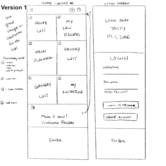
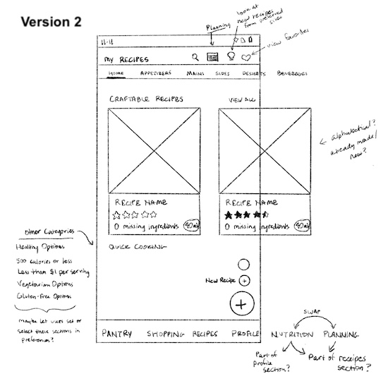
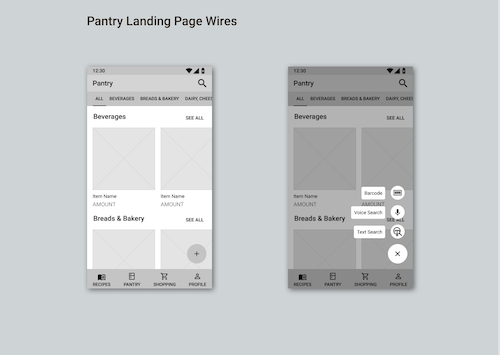
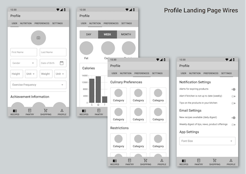
Rather than get too far into Material Design details I started with basic wireframes to establish the layout and basic content of the app. The wires started out very rough, but I continued to refine them until I felt ready to move onto the visual design part of the project.


Once I felt the wires were at a good point I started finalizing the font, choosing colors, and establishing final spacing based on Material Design UI.
I choose to stick with the Roboto font, which is the standard Android font. I personally like the way it looks and as it fits well within the Material Design guidelines I didn't feel the need to complicate the design with elaborate typography.
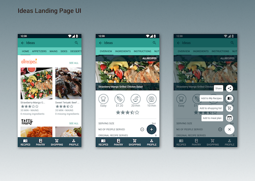
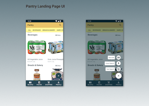
When considering the psychology of color, reds and oranges are traditional colors for food-related apps. I considered these as my primary color, but in the end I wanted to have a different color for each section that fit well in a single theme. I went with a dark blue that worked well with the four section colors of aqua, red-orange, yellow-orange, and yellow. In this way the color of the app bar will also give the user an indication of what section they are in along with the section title.


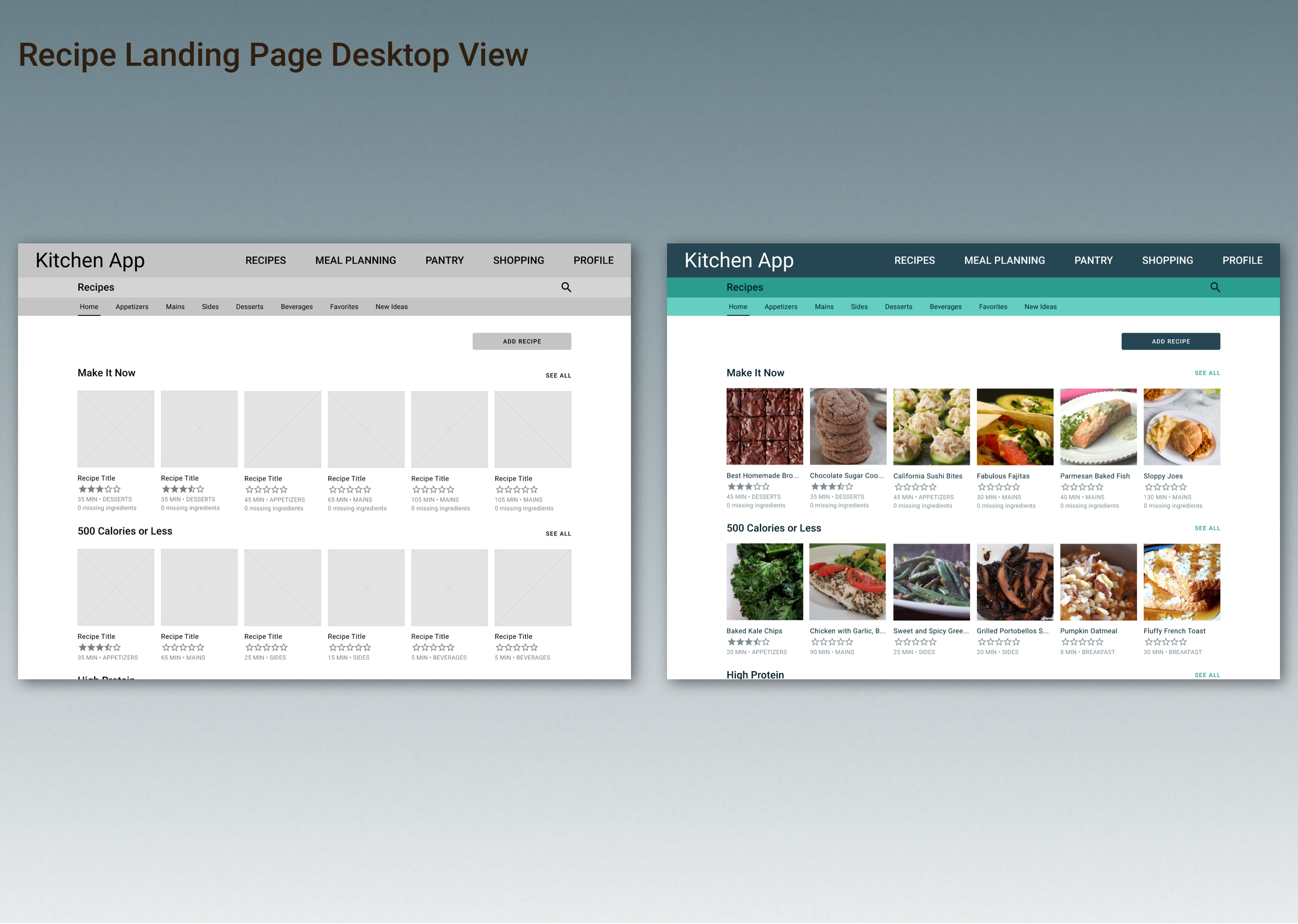
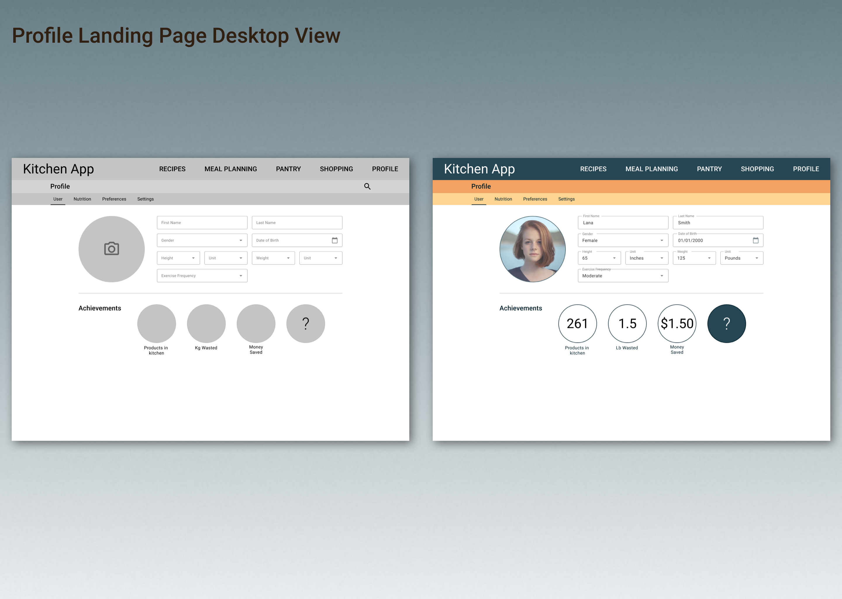
Once the mobile version of the site was fleshed out I decided to create the desktop version for each of the main section's landing pages. These key screens give a good idea of how the mobile content adapts to a much larger screen.

And there you have it! There are plenty of other screens that can be built out to help describe functionality. I've only taken this project as far as I need to in order to ensure I have the basic features covered.
As this was my first major project in Figma I was able to learn a lot about the application - it has a lot of advantages over Sketch, which has been my primary design app. For example, I liked how smooth it worked and how integrated a lot of the functions seemed to be. However, I felt like Sketch does a better job with libraries and using components, which I relied on fairly heavily through the project.
If you'd like to dig deeper into the mobile UI or other sections feel free to visit My Kitchen App Figma file. You can also view the interactive prototype in Figma.
Website content and design © Alisha Ober
